Understanding Climate Variability and Change

In order to understand climate change, we must understand climate variability. This module will outline some key concepts such as weather, climate variability and of course, climate change.
Weather vs. Climate; Natural Variability vs. Climate Change
Weather describes current atmospheric conditions, such as rainfall, temperature, and wind speed, at a particular place and time. It changes from day to day.
Climate is the average (or ‘normal’) pattern of weather for a particular place over several decades. Changes in climate are hard to detect without very long-term records.
“Climate is what you expect, weather is what you get” Heinlein, 1974.
One way to understand the difference between weather, climate variability and climate change is to think about how they operate on different time scales.
The big arrow in Figure 1 refers to different periods of time – days, months, years, decades and centuries. We can see here that weather refers to hours, days and maybe months; climate refers to months, years and decades, and climate change refers to decades and centuries. Examples of weather are rain storms that might last one or two hours and tropical cyclones that may last days. Climate variability can be defined by climate patterns such as the El-Niño Southern Oscillation and climate change refers to things which happen over centuries, like global warming.
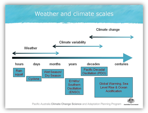
Figure 1: A guide to the timescales applicable to weather, climate variability and climate change.
We are now going to take a closer look at the each of these timescales. The graph in Figure 2 shows an example of the changes in air temperature over five days. On the vertical axis (also called the “y-axis”) the temperature is displayed and on the horizontal axis (the “x-axis”) are the five days. This shows the influence of weather, as well as the daily (also called the “diurnal”) cycle – for example the minimum daily temperatures and maximum daily temperatures are different on each day. Some days are warmer than others and there is variability from hour to hour.

Figure 2: Example air temperature over five days
The graph in Figure 3, the time scale has been expanded to show temperature changes over five years. The temperature is shown in degrees Celsius on the y-axis and the years are shown on the x-axis. The black rectangle shows a five-day period similar to that shown in Figure 2. The blue line shows the daily temperature variation and the red line shows the average daily temperature over the five years. Daily temperatures vary greatly but the daily averages clearly show that some parts of the year are regularly warmer than others. These seasonal cycles are an example of a temperate climate with four distinct seasons: summer, autumn, winter and spring.

Figure 3: Example air temperature over five years (the black rectangle shows a five-day period like that shown in Figure 2).
You can see how summer temperatures are higher and winter temperatures are lower in some years than others due to natural variation. However, if we want to understand the general climate of this area, we need to consider a longer time period such is shown in Figure 4.
Over a longer period, such as 50 years (see Figure 4), we can see the year to year variability more clearly. We can calculate the long term mean, or average climate and we can see whether there is a trend in the mean climate. In this example there is a warming trend identified by the black line going up. This shows an increase of more than one degree Celsius over fifty five years. This is not what would be expected under normal conditions and is very likely an indication that the climate is changing. It should be noted however, that even though there is a gradual overall warming trend over the fifty years, the situation can appear quite different if we look at shorter periods. The short blue lines show that some 10 year periods show a decrease (a) while others show a more dramatic increase (b) in temperature. These short-term changes are due to natural variability – caused by factors such as the El Niño Southern Oscillation.

Figure 4: Example air temperature over 50 years (the black rectangle shows a five-year period like that shown in Figure 3).
What causes climate variability?
In the Pacific region, climate is influenced by three main large-scale features (see Figure 5):
- South Pacific Convergence Zone (SPCZ)
- Inter-Tropical Convergence Zone (ITCZ)
- West Pacific Monsoon (WPM)
The South Pacific Convergence Zone is a band of heavy rainfall extending from near the Solomon Islands to east of the Cook Islands. It is strongest in the Southern Hemisphere wet season.
The Intertropical Convergence Zone stretches across the Pacific just north of the equator and is strongest in the Northern Hemisphere wet season.
The West Pacific Monsoon is driven by large differences in temperature between the land and the ocean. It moves north to mainland Asia during the Northern Hemisphere summer and south to Australia in the Southern Hemisphere summer. The seasonal arrival of the Monsoon usually brings a switch from very dry to very wet conditions.

Figure 5: The main influences on the climate of the Pacific Region, shown here in their long-term average November to April positions. The arrows show near surface winds, the blue shading represents the bands of rainfall convergence zones, the dashed oval shows the West Pacific Warm Pool and the H’s represent typical positions of moving high pressure systems.
These features are, in turn, influenced by the El Niño Southern Oscillation (ENSO) which is the main cause of year to year variability in the climate of the Pacific. ENSO affects the strength and position of the main climate features, leading to variability in rainfall, temperature, winds, cyclone activity, ocean currents and sea level.
During the Southern Hemisphere wet season, the heaviest rainfall occurs in the monsoon region and in the South Pacific Convergence Zone.
The map in Figure 6 shows the long term mean climate of the Southern Hemisphere wet season rainfall and surface winds. Rainfall is shown by the colours, where darker blue represents the wetter areas and purple/red the driest. The wind is shown by the arrows.

Figure 6: Long term mean rainfall and wind in the Southern Hemisphere wet season over the Pacific. Colours show rainfall in mm/day and arrows show wind speed and direction averaged for December to February.
The South Pacific Convergence Zone and the Inter-Tropical Convergence Zone can be seen as regions of high rainfall. Also, high rainfall can be seen over the western Pacific because of the West Pacific Monsoon. Winds converge to form the South Pacific Convergence Zone.
In contrast, the climate of the Southern Hemisphere dry season (Figure 7) has the heaviest rainfall in the monsoon region and the Inter-Tropical Convergence Zone.

Figure 7: Long term mean rainfall and wind in the Southern Hemisphere dry season over the Pacific. Colours show rainfall in mm/day and arrows show wind speed and direction averaged for June to August.
As we have seen, climate variability describes short-term changes in climate that take place over months, seasons and years. This variability is the result of natural, large-scale features of the climate that we looked at earlier. It is likely that you have heard of El Niño and La Niña, these are the two phases of the El Niño-Southern Oscillation (sometimes shortened to ENSO – see Figure 8) which is the most important driver of year-to-year variability in climate in the Pacific region. The different phases of ENSO can cause droughts and floods. Each El Niño and La Niña event is different and so they have different impacts. El Niño and La Niña events drive changes in circulation, winds, rainfall and ocean surface temperatures.
Normal conditions, or the neutral phase of ENSO, is shown on the left in Figure 8. The trade winds (white arrows) blow to the west and cause a build up of warm surface water (orange-red areas) and higher sea level in the West Pacific. The warm water heats the air above it, making the moist air rise and forming clouds (this is called convection). This warmer air then moves east to where the air is cooler, the cooler air sinks towards the surface and moves west, creating a convective circulation.
")
Figure 8: Three-dimensional depiction of three important phases of the El Niño-Southern Oscillation (ENSO): Normal (left), La Niña (centre) and El Niño (right). (Image source: NOAA, http://www.pmel.noaa.gov/tao/elnino/nino-home.html).
Under La Niña conditions, shown in the centre of Figure 8, ocean temperatures across the central and eastern tropical Pacific Ocean are cooler than normal (blue and green areas) and the easterly trade winds are stronger than normal across the Pacific Ocean. La Niña usually brings wetter than normal conditions to countries like Australia, Niue and Tonga because rainfall moves farther to the south-west than under normal conditions.
El Niño (Figure 8, right) brings extensive warming of the central and eastern Pacific and weaker than normal (easterly) trade winds leading to a major shift in weather patterns across the Pacific. Typical El Niño conditions in the northern hemisphere winter result in the western Pacific experiencing very dry conditions and the central Pacific around the equator experiencing wetter conditions. The 1997 El Niño brought drought to countries like Papua New Guinea.
Causes of climate change
The Earth’s climate has changed over the centuries and millennia due to a number of different factors (see Figure 9).
These include:
- Natural changes in the Earth’s orbit which may occur over time scales of thousands of years
- Natural changes in the sun which affect the amount of incoming solar radiation
- Natural, large-scale volcanic eruptions which eject large amounts of ash into the atmosphere. The ash may remain in the atmosphere for several months or years reflecting sunlight back into space and resulting in a drop of mean global surface temperature
- Changes in atmospheric chemistry (such as the quantity of greenhouse gases) – both natural and caused by human activities. It is almost certain that most of the changes seen in the past century have been caused by human activities such as burning fossil fuels. We will now concentrate on these changes.

Figure 9: Factors that lead to changes in the Earth’s climate.
The role of ‘greenhouse gases’
The greenhouse effect is a natural process that makes our planet liveable. Without the greenhouse effect, the average temperature at the earth’s surface would be below the freezing point of water. As shown in Figure 10, some of the greenhouse gases in the atmosphere absorb the outgoing solar radiation and reflect it back to earth keeping Earth’s temperatures much as we know them now. The greenhouse gases in the atmosphere can be compared to the walls of a greenhouse, keeping the heat in. These greenhouse gases include: water vapour, carbon dioxide (CO2), methane, nitrous oxide and some industrial gases such as chlorofluorocarbons (CFCs). Water vapour and carbon dioxide are the most important greenhouse gases.
Adding more of a greenhouse gas, such as CO2, to the atmosphere intensifies the greenhouse effect, thus warming Earth’s climate. The amount of warming depends on various feedback mechanisms.

Figure 10: The ‘Greenhouse Effect’. (Source: Intergovernmental Panel on Climate Change, Fourth Assessment Report, 2007).
As can be seen in Figure 11, current atmospheric concentrations of carbon dioxide (in red) far exceed pre-industrial values (pre-1700 values). This has been determined in part by analysing the air trapped in ice cores spanning the past 800,000 years. The inset picture shows air bubbles trapped in an ice core taken from Antarctica - this air has been tested for levels of C02.
The graph shows carbon dioxide levels are now rising at a very fast rate. During the 1990s, the amount of carbon dioxide in the air rose by less than 1 part per million per year. From 2000–2005, the growth rate increased to more than 2.5 parts per million per year. Carbon dioxide concentrations are now greater than at any time during the past 800,000 years. The rate of increase is accelerating.
At the same time as carbon dioxide is increasing in the atmosphere, the earth is warming. The climate system is currently warmer than at any time during the past 2000 years, and perhaps the warmest it has been for a million years. This is consistent with the increases in carbon dioxide emissions.
 and methane (CH4) for the past 1000 years")
Figure 11: Atmospheric concentrations of carbon dioxide (CO2) and methane (CH4) for the past 1000 years. Inset: ice-core sample showing trapped air bubbles. (Source: CSIRO)
The graph in Figure 12 shows 100 years (1910-2010) of annual mean surface air temperature anomalies (relative to the 1961-1990 mean) for the globe and the PCCSP/PACCSAP region. The solid blue and red lines indicate 11-year running means for the global and PCCSP/PACCSAP region temperature respectively. You can also see that most of the region’s warmest years have occurred over the last two decades. Increased concentrations of greenhouse gases in the atmosphere due to human activities are most likely the underlying cause of warming in the 20th century.
 for the globe and the PCCSP/PACCSAP region from 1910-2010")
Figure 12: Surface air temperature anomalies (relative to 1961-1990) for the globe and the PCCSP/PACCSAP region from 1910-2010.
As we put greenhouse gases into the atmosphere, this creates warming, and a lot of this heat goes into the ocean. The chart in Figure 13 shows that most of the extra heat from global warming is being absorbed by the oceans and only very small amounts are absorbed by land masses and the atmosphere. This results in changes to the ocean which we will look at in the next section.

Figure 13: Heat content of the ocean, land and atmosphere from 1950 to the early 2000s. Note that almost all of the added heat has gone into the ocean. (Source: http://www.skepticalscience.com/graphics.php)
Changes in the Oceans
As water warms it expands. Added to this, glaciers and ice sheets melt as the atmospheric temperature increases. These two factors, expanding warmer water and ice melt, result in sea level rise. Observations of sea level rise from tide gauges over the 20th century show a global average sea level rise of 1.7 mm a year, or a total of 17 cm over the 100 years. The graph in Figure 14 shows global average sea level since 1850. The solid blue line is based on tide gauge data and the red line is sea level measured by satellites. Since 1993 the rate of rise measured by satellite altimeters has been about 3.2 mm/yr and from tide gauges about 3.0 mm/yr. Sea level rise is a challenge for low lying areas.

Figure 14: Global average sea level since 1850 derived from tide gauge data (blue line) and satellite data (red line).
The ocean absorbs about one quarter of the annual emission of CO2 resulting from human activities. This is good in that it slows the rate of atmospheric warming but the consequence is ocean acidification.
When the CO2 is taken up by the ocean, it combines with the seawater to produce carbonic acid, a weak acid (Figure 15). The ocean is alkaline but the addition of carbonic acid reduces the alkalinity. As a result, many key species in tropical ecosystems, including reef building corals, show a reduced capacity to grow calcium carbonate skeletons and shells. Ocean acidification could have serious consequences for these reef ecosystems which are already stressed by global warming and other pressures like fishing. This will in turn impact industries such as coastal fisheries and others that depend on marine resources.

Figure 15: Carbon dioxide is absorbed by the oceans leading to a change in the water chemistry. (Source: Hoegh-Guldberg et al. 2007)
The climate has changed across the Pacific region and while there is considerable variation from country to country, there are some general similarities across the region.
Temperature has warmed at all locations in the Pacific, with Pacific island annual temperature trends ranging between 0.1 to 0.2 °C/decade (1960-2009). Rainfall across the region has increased and decreased in response to natural climate variability but over the last 50 years, rainfall totals have increased to the north-east of the South Pacific Convergence Zone and declined to the south.
There have been significant changes to the ocean too with acidification increasing across the region, Sea level has risen, however there are differences across the region.
In summary
This module has outlined some of the key aspects of both climate variability and climate change. Climate is the long term average of weather, and climate variability acts on different timescales. ENSO is the most important driver of year to year variability in the region. A large increase in greenhouse gases has resulted in climate change, which is a long-term trend in the mean climate. While there is a clear trend in increasing air temperatures, it is often more difficult to identify climate change trends in rainfall because rainfall has larger natural variability. It is important to remember that climate variability and climate change can occur together so we while we still experience cold and cool weather, the overall average climate is warmer than it was one hundred years ago.
References
Hoegh-Guldberg O, Mumby PJ, Hooten AJ, Steneck RS, Greenfield P, Gomez E, Harvell CD, Sale PF, Edwards AJ, Caldeira K, Knowlton N, Eakin CM, Iglesias-Prieto R, Muthiga N, Bradbury RH, Dubi A and Hatziolos ME (2007) Coral reefs under rapid climate change and ocean acidification. Science 318, 1737-1742.
Next Topic (Introduction to climate change projections)